BonaFide
A new face of the daring brand

A new face of the daring brand
Type
E-Commerce
Release date
19 Feb 2019
Deliverables
UX Wireframe, UI Design, Development, Marketing
MAIN OBJECTIVE
Make a global online store redesign. Carry out the technical implementation of business processes on the site. Create a personal account architecture for working with franchisees.
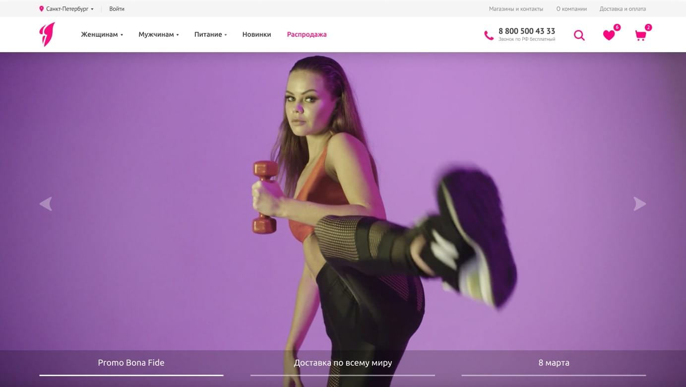
Ux design
01
We studied historical data in Google Analytics for the last 4 years and identified the most popular entry and exit pages. Thanks to behavioral analysis, we were able to sift buyers from window shoppers. Based on the quantitative metrics, we created 200 screens of the future website with various properties. All this was done for just one purpose – make it easier for users to find the right product and add it to the cart.
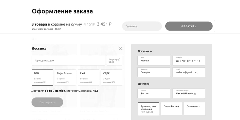
Wireframe
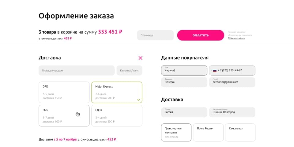
Design
visual magic
02
A new fresh look with vibrant colors, user friendly interface and juicy photos of products.
Product pages are easy to use and navigate. Large, high-def photos look great and contribute to the experience. Users can buy from just one screen, which is a pleasure for online shoppers. The result – happy customers who love to come back.
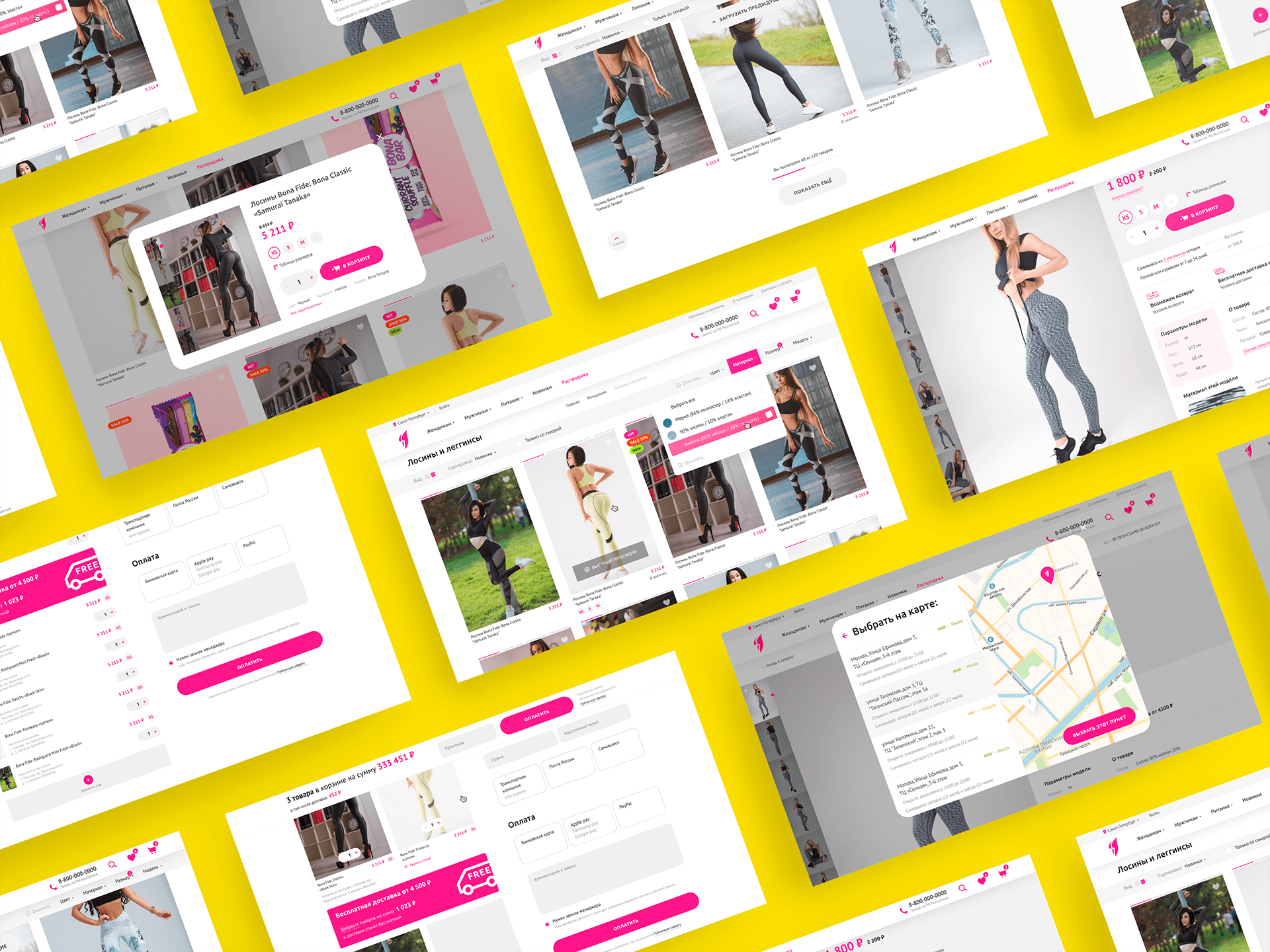
Desktop Design
The mobile experience is great too. Filters can be quickly applied, catalog navigation is well-thought-out, all important information on product pages is always clearly visible.
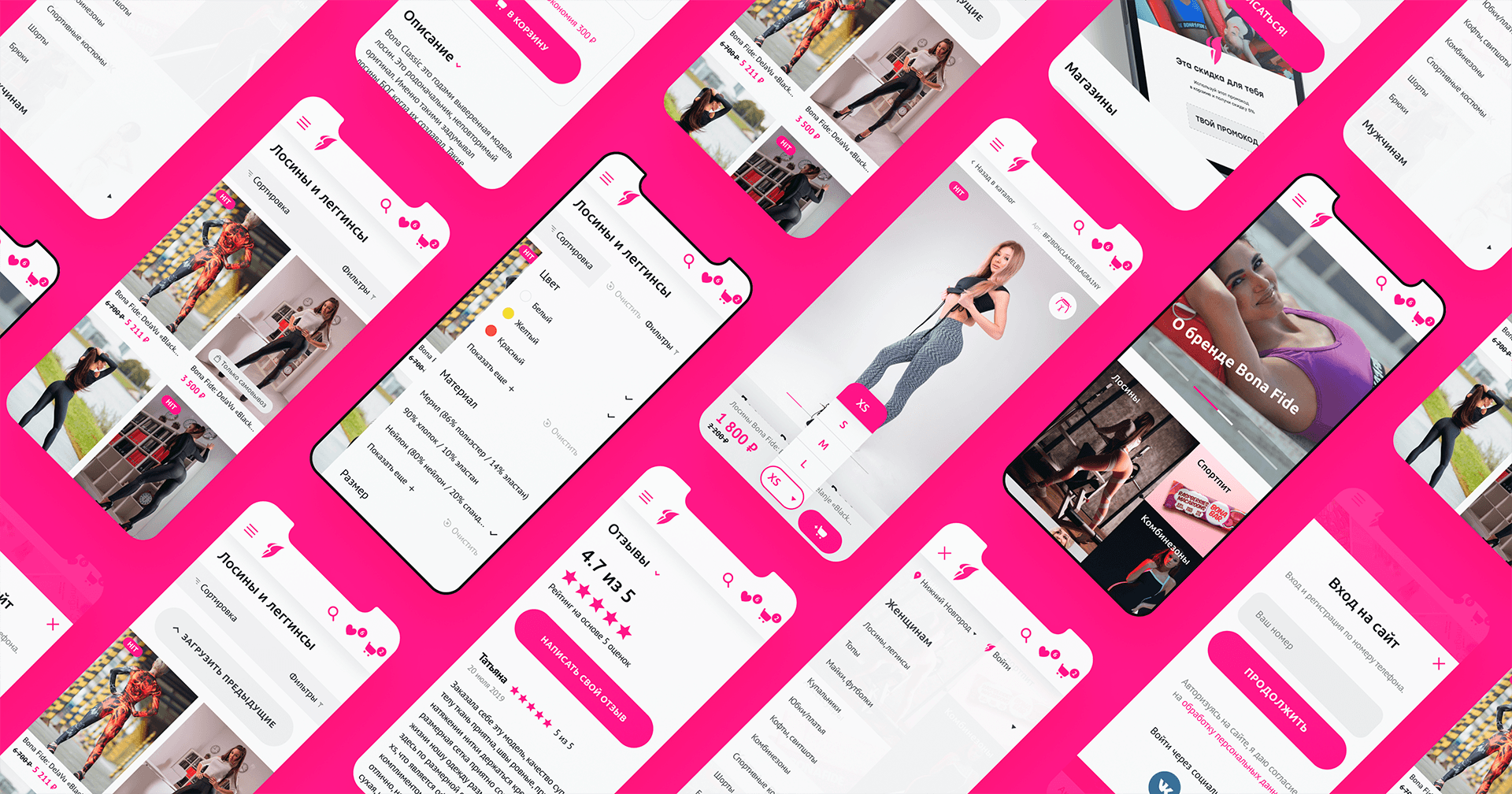
Mobile Design
Code
03
Based on the quantitative metrics, we created 200 screens of the future website with various properties. All this was done for just one purpose – make it easier for users to find the right product and add it to the cart.
ordering process
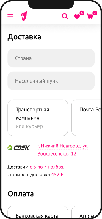

shopping cart code

ordering
process

shopping
cart code
We implemented personal accounts architecture for franchisees. We created convenient desktop and mobile versions where users can sign up with SMS, generate invoices for orders, receive delivery notifications and quickly contact their personal manager.
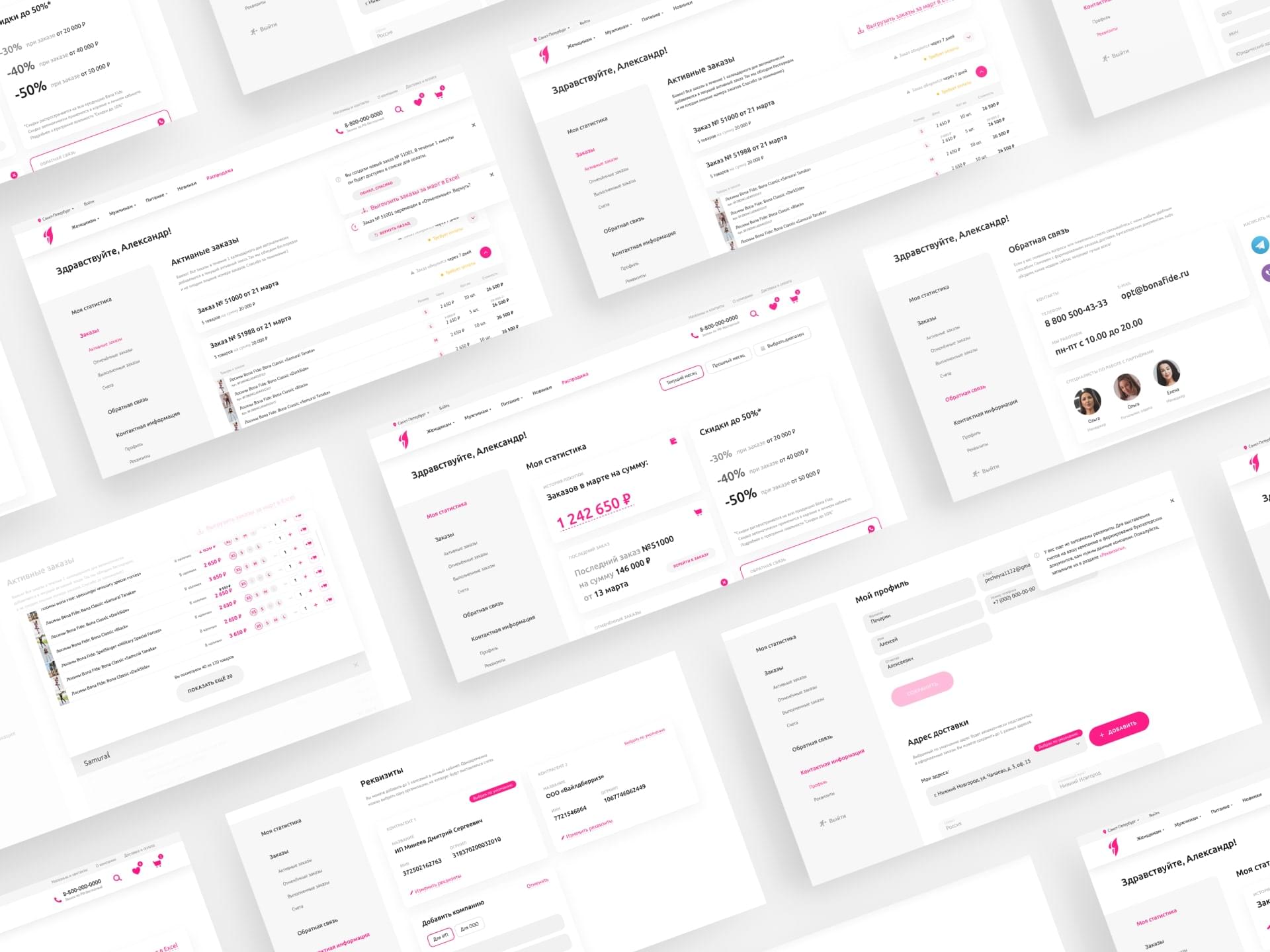
Technology stack
Wireframing


Design


Front-end


Back-end

Data Base

Finding bugs
04
Our team has spent 150+ hours and tested each page: from checking content display on various devices to checkout process and simulating over 50 personal account scenarios.
LEAD GENERATION
05
+160
Gross profit growth from the site
+18
Growth of repeated purchases
+20
Average check growth for purchases from mobile devices
We implemented a comprehensive stock system: each week – a new stock that fuels interest in the brand. Provocative content, juicy visuals and a well-tuned sales funnel made it possible to achieve the required KPIs in a short time.

Photo shoots

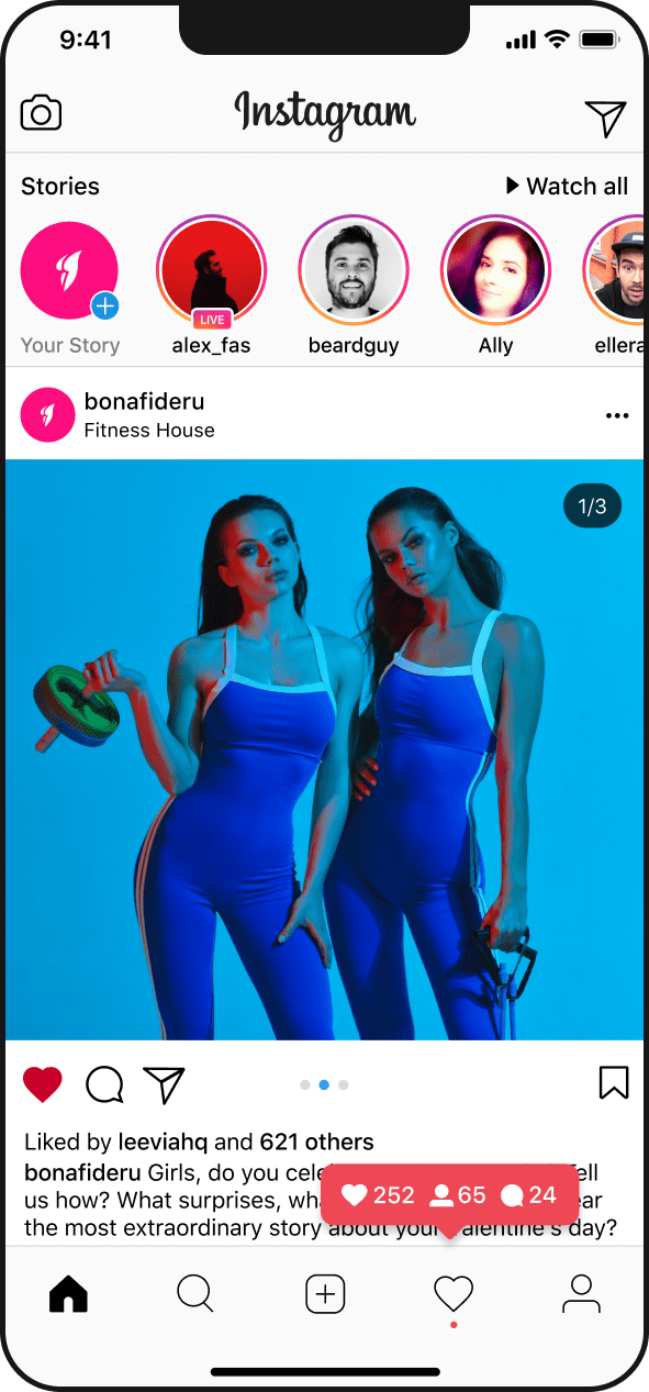


Photo Sessions


Photo Sessions
Project team
Marketing
Adam Grigoryan
Development
Dmitriy Voropaev, Kirill F
Art-direction
Eugene Ruychin
Design
Vladislav Tushkin
Fill the form and we will be in touch shortly.