MarketDo4a
A radical redesign of the sports nutrition website

A radical redesign of the sports nutrition website
Type
E-Commerce
Release date
19 Feb 2019
Deliverables
UX Wireframe, UI Design, Development, Marketing
MAIN OBJECTIVE
Make a global redesign of an online sports nutrition store.
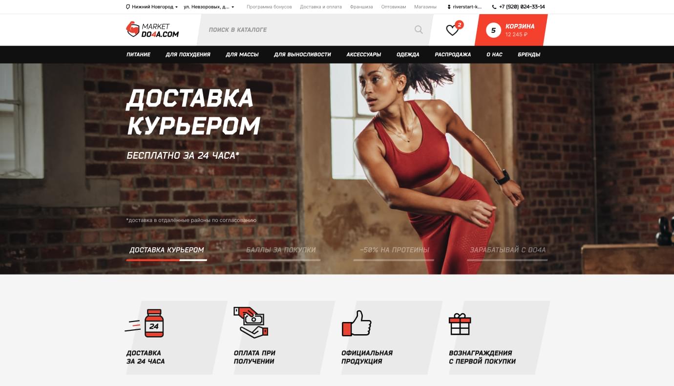
Ux design
01
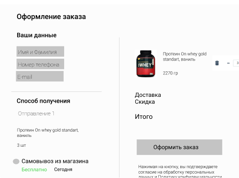
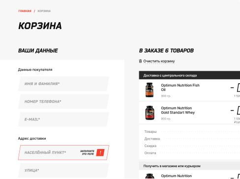
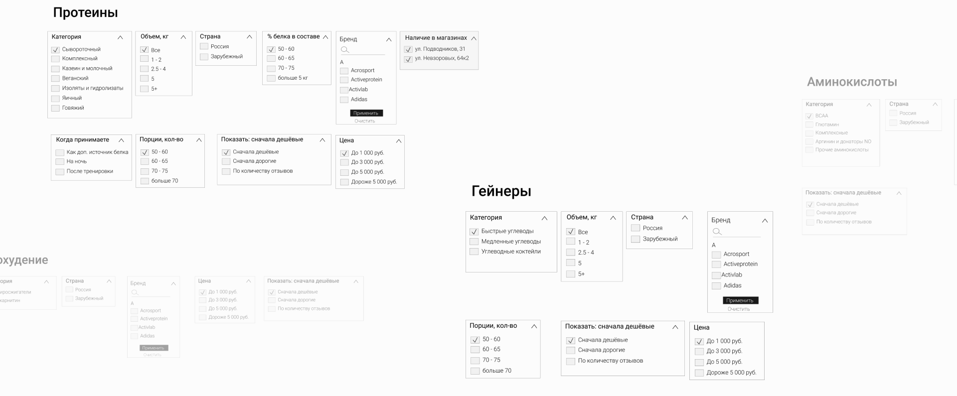
We prepared 30 versions of the cart with various types of delivery and data sets, 50 custom filter criteria for quick search, studied the product range with over 2,000 items and selected the ones that would drive more profit.
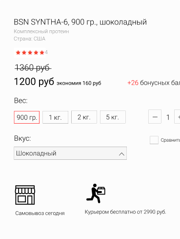
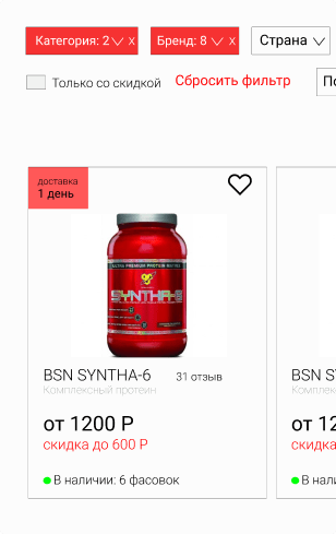
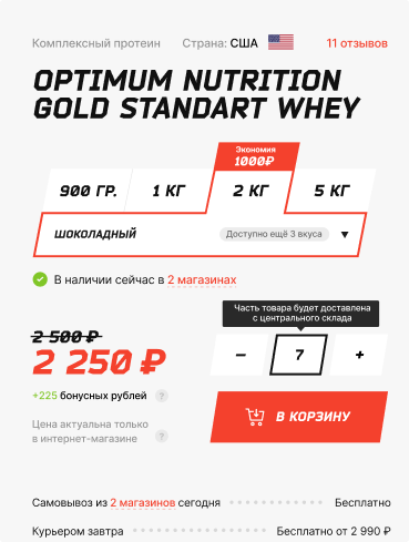

Each product category has its own filters. For proteins, you can choose the percentage of protein in the product, for amino acids, you can specify the type – capsules or powder. Custom filters make it very easy for user to select products in any category.
visual magic
02
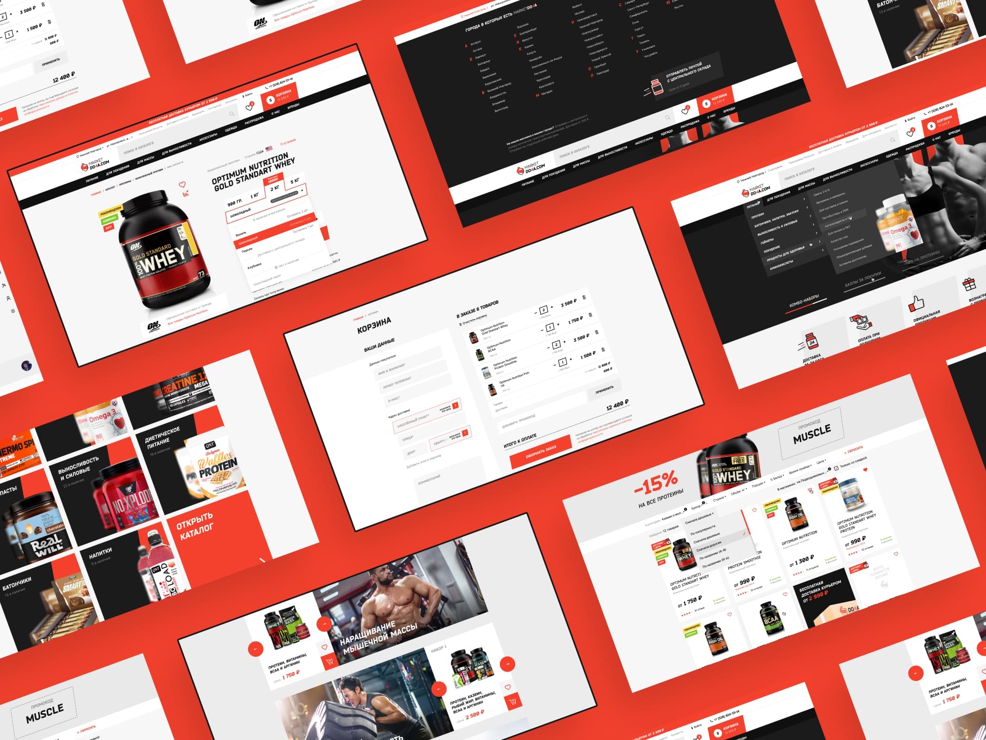
We gave the brand the look of a gangster-like movement
Product pages are very easy to use and navigate. Large and high-def photos immediately catch the eye. The order can be made with just one screen, which is a pleasure for online shoppers. As a result, we create great user experience that turns visitors into customers who are willing to come back and buy more.
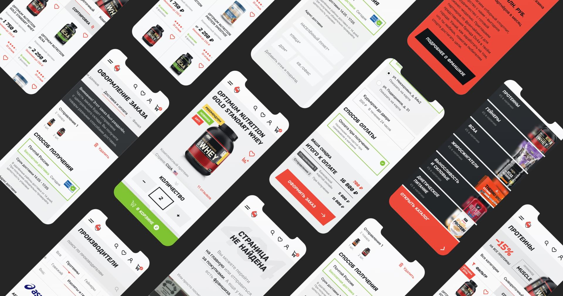
Mobile experience is no exception here. Filters can be quickly applied, catalog navigation is well-thought-out, and the most important information on the product pages is always clearly visible.
Code
03
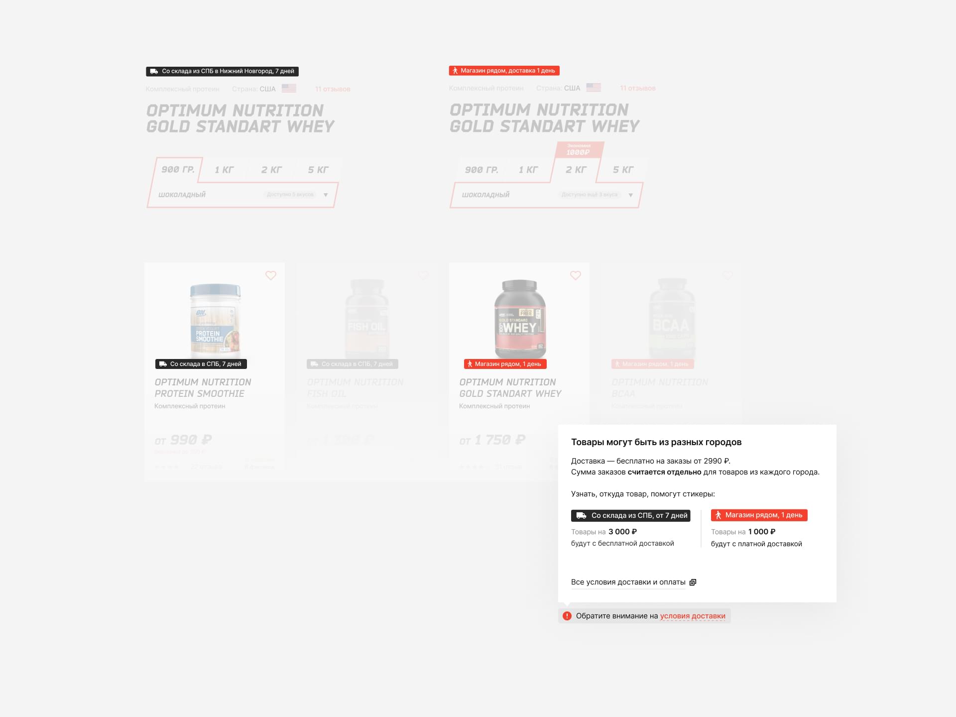
Marketdo4a has a large franchise network. One of the challenging tasks was to meet its needs in terms of order creation and logistics.
There are situations when customers can receive one order in two different ways: from a store in their city or from a warehouse located in another city.
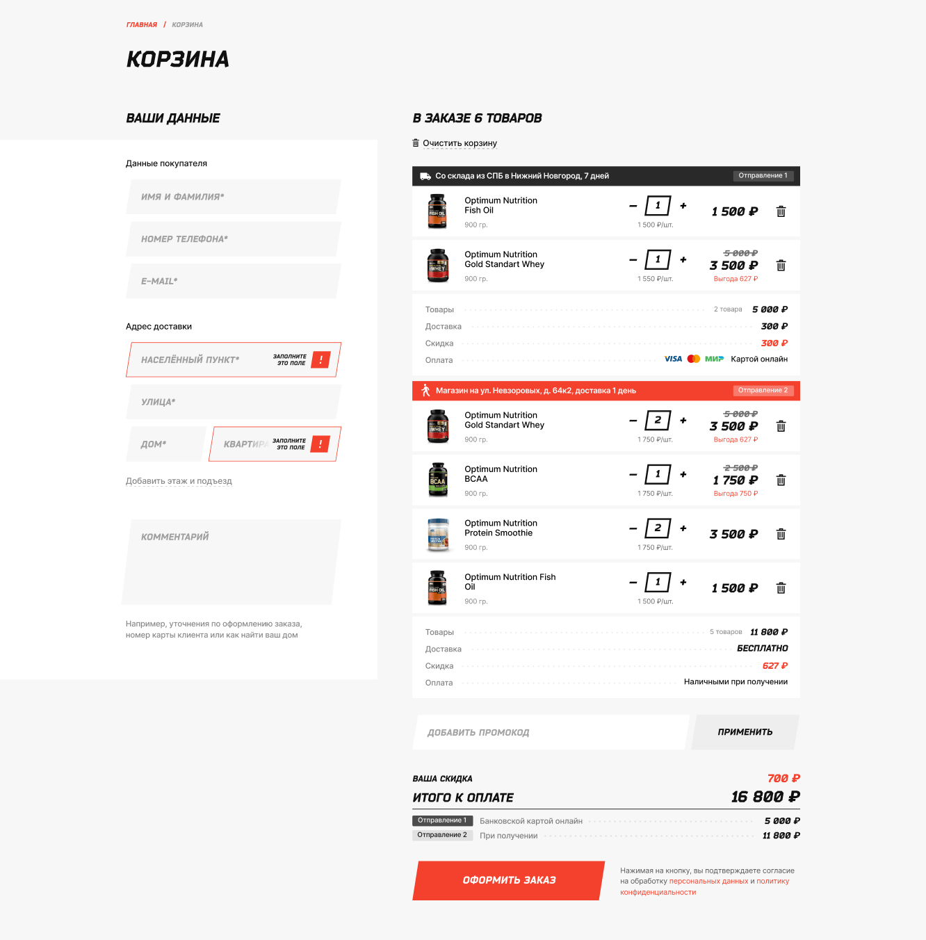 From a warehouse in another cityFrom a store in customer’s city
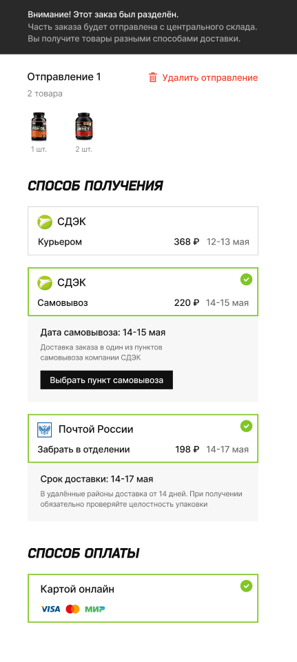
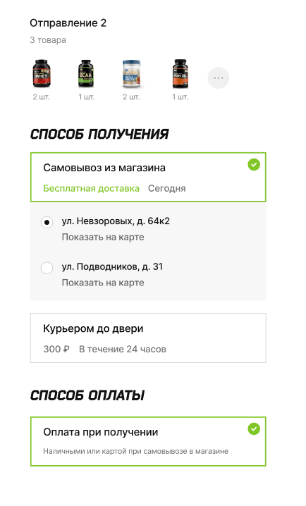
We took this into account when describing the logic and during front-end and back-end development to make sure everything works correctly and both franchisees and shoppers are happy.
Technology stack
Wireframing


Design


Front-end


Back-end

Data Base

Project team
Marketing
Adam Grigoryan
Development
Dmitriy Voropaev, Kirill F
Art-direction
Eugene Ruychin
Design
Vladislav Tushkin
Fill the form and we will be in touch shortly.